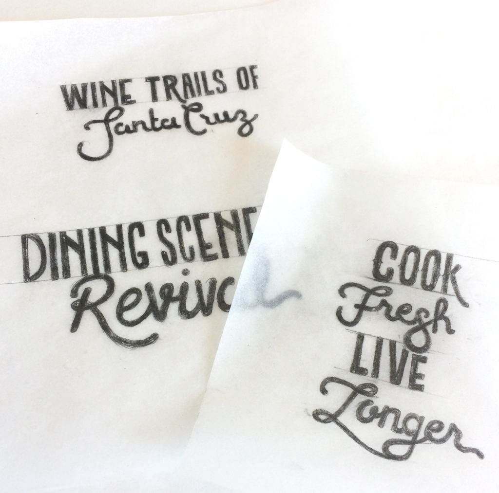
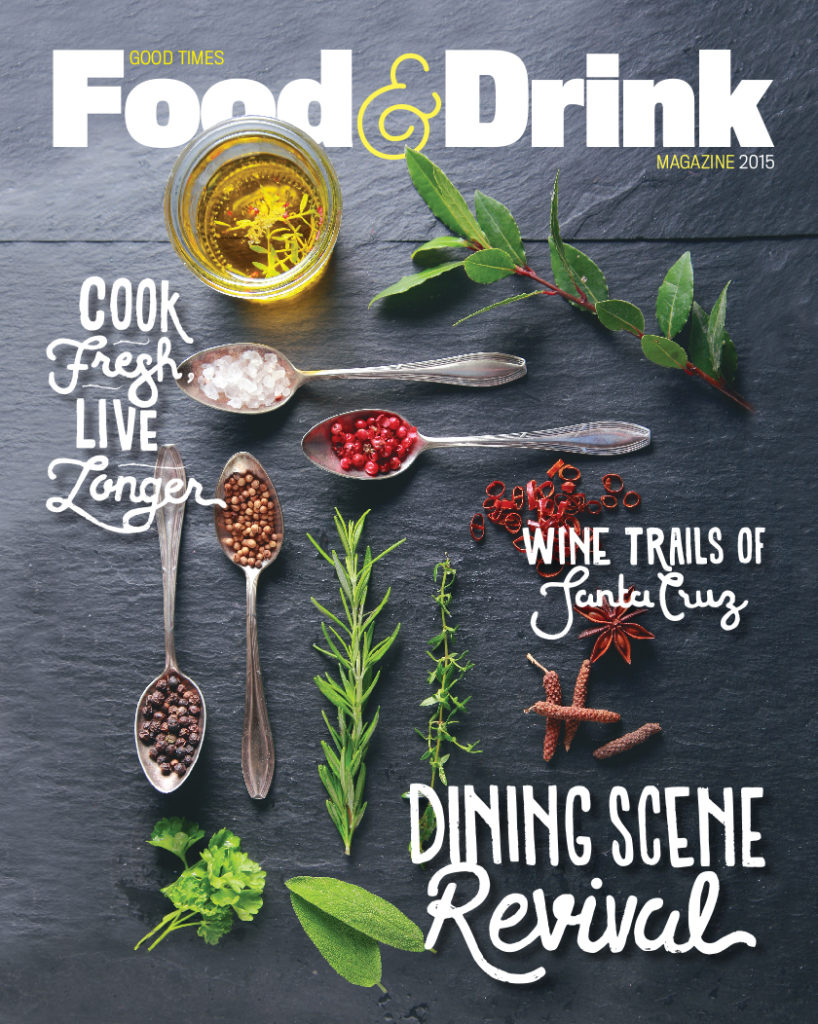
For the cover of the Good Times Food & Drink magazine, the art director wanted a rough hand-drawn feel. Naturally, I thought the best way to get hand-drawn…Was to hand draw. Keeping my pencil sketches intentionally imperfect, I scanned and vectorized them to be placed directly on the chalkboard-esque background that seemed tailor made for the lettering.


