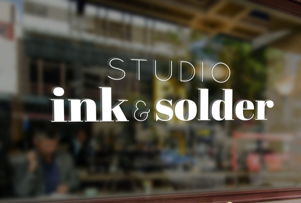
Studio Ink & Solder is a combined studio space of two artists. One works with letterpress, wood block prints, and other ink driven forms, and the other is a very talented jewelry maker. The two ladies wanted something that could represent the two of them and their shared talents.
For this logo, I went for the three C’s. What ARE the three C’s?
1. Contrast (thick with thin, serif with sans serif),
2. Clean (solid, clean lines, that stand up in whatever size the logo is used it), and
3. Classic (something that will stand the test of time)


